A couple days ago I started this drawing. I followed along with Feng Zhu (one of my favorite artists) from beginning to completion. This is his concept. Feng worked with ink and marker and according to the DVD, which didn't appear to be sped up, he finished in approximately 2 hours. I tried to replicate his technique using digital. I worked mostly with Autodesk Sketchbook Pro, as it has a great ruler and ellipse tool. It took me a total of approximately 6 hours to do this as I would constantly pause the DVD and do my own thing.
This was a very fun exercise. I look forward to doing more as I continue to work through the rest of my Gnomon DVD collection. Eventually I will go back through and attempt to apply the things I learn to my own universe and characters, primarily those from my novel.
Below you can see the step by step process I used.
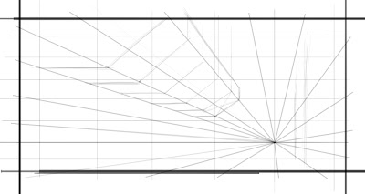 |
| The first step is roughing out some quick guidelines. I laid down the horizon line and started to draw out diagonals that recede to the vanishing point. Next I dropped in some more vertical lines and extra horizontal lines for measurement. At this point I wasn't using Sketchbook Pro, but Corel painter. I used a clear plastic ruler over my Cintiq monitor to get the straight lines. |
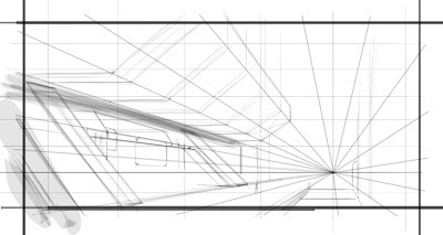 |
| Here I started freehand drawing some more forms and dropped in some value to help define the main building in the foreground. |
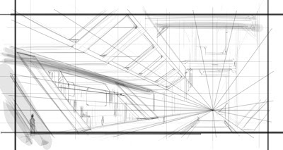 |
| Still working in Corel Painter I continued to quickly sketch, making sure to work the entire piece and not linger in one area too long. This is important, because I would otherwise obsess over details that don't matter yet. |
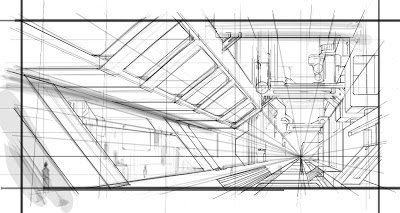 |
| At this stage Feng started inking. So I switched over to Autodesk Sketchbook Pro. Using the ballpoint pen tool and the ruler and ellipse tool I was able to create lines with consistent angles. This is important in perspective drawing as it helps to reinforce scale. If an object or building structure repeats into the distance it needs to do so without question. |
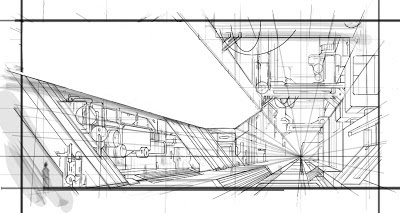 |
| I was unhappy with the upper structure. I had eyeballed the perspective but it didn't read as I wanted. So I erased it with a plan to remake it. |
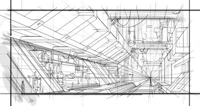 |
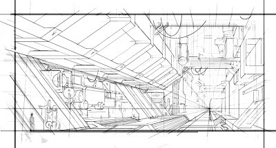
| Here I "rebuilt" the upper structure using some tricks with perspective drawing to ensure that the shapes repeated into the distance with accuracy. |
 |
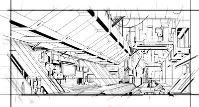
| At this point in the DVD, Feng made a photocopy of his drawing and sharpened the image to clean it up and make the line work read better. Since I was working digitally I flattened the image and brought it into Photoshop, where I adjusted the levels to resemble the photocopy Feng had. |
 |
| Back in Sketchbook Pro I used the felt pen tool to start blocking out shadow shapes and help some of the suggested forms pop more. |
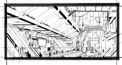 |
| The pen stage is just about finished here. I added some figures for scale. Now you can really tell how big this structure is and threw down a dark frame to give the viewer a focused point of view. |
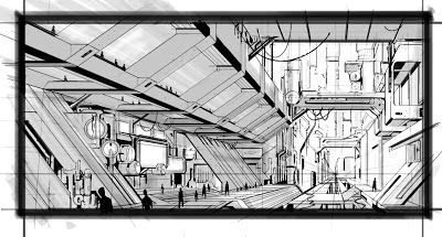 |
| At this stage I went back to work in Corel Painter. I tried different tools in Sketchbook Pro to get the look for Prismacolor marker, but it wasn't working. With Painter I am able to use the Scratch Board tool at 30% opacity on a multiply layer set between 20-30% opacity. What this essentially does is create layers. Each new layer added with the same settings contributes value so it's like having the marker dry and going over it again. |
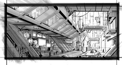 |
| Almost done. I added some more value to really bring the closer objects forward. Finally I added some white highlights to the edges of hard surfaces. |


No comments:
Post a Comment