Thursday, November 8, 2012

Detailed environmental drawing.


A couple days ago I started this drawing. I followed along with Feng Zhu (one of my favorite artists) from beginning to completion. This is his concept. Feng worked with ink and marker and according to the DVD, which didn't appear to be sped up, he finished in approximately 2 hours. I tried to replicate his technique using digital. I worked mostly with Autodesk Sketchbook Pro, as it has a great ruler and ellipse tool. It took me a total of approximately 6 hours to do this as I would constantly pause the DVD and do my own thing.

This was a very fun exercise. I look forward to doing more as I continue to work through the rest of my Gnomon DVD collection. Eventually I will go back through and attempt to apply the things I learn to my own universe and characters, primarily those from my novel.

Below you can see the step by step process I used.

The first step is roughing out some quick guidelines. I laid down the horizon line and started to draw out diagonals that recede to the vanishing point. Next I dropped in some more vertical lines and extra horizontal lines for measurement. At this point I wasn't using Sketchbook Pro, but Corel painter. I used a clear plastic ruler over my Cintiq monitor to get the straight lines.
Here I started freehand drawing some more forms and dropped in some value to help  define the main building in the foreground.
Still working in Corel Painter I continued to quickly sketch, making sure to work the entire piece and not linger in one area too long. This is important, because I would otherwise obsess over details that don't matter yet.
At this stage Feng started inking. So I switched over to Autodesk Sketchbook Pro. Using the ballpoint pen tool and the  ruler and ellipse tool I was able to create lines with consistent angles. This is important in perspective drawing as it helps to reinforce scale. If an object or building structure repeats into the distance it needs to do so without question.
I was unhappy with the upper structure. I had eyeballed the perspective but it didn't read as I wanted. So I erased it with a plan to remake it.
Here I "rebuilt" the upper structure using some tricks with perspective drawing to ensure that the shapes repeated into the distance with accuracy.
At this point in the DVD, Feng made a photocopy of his drawing and sharpened the image to clean it up and make the line work read better. Since I was working digitally I flattened the image and brought it into Photoshop, where I adjusted the levels to resemble the photocopy Feng had.
Back in Sketchbook Pro I used the felt pen tool to start blocking out shadow shapes and help some of the suggested forms pop more.
The pen stage is just about finished here. I added some figures for scale. Now you can really tell how big this structure is and threw down a dark frame to give the viewer a focused point of view.
At this stage I went back to work in Corel Painter. I tried different tools in Sketchbook Pro to get the look for Prismacolor marker, but it wasn't working. With Painter I am able to use the Scratch Board tool at 30% opacity on a multiply layer set between 20-30% opacity. What this essentially does is create layers. Each new layer added with the same settings contributes value so it's like having the marker dry and going over it again. 
Almost done. I added some more value to really bring the closer objects forward. Finally I added some white highlights to the edges of hard surfaces. 

Monday, November 5, 2012

Feels good to draw agian

It's been a few weeks since I carved out some time from my schedule to do some detailed sketching. I know I did those black and white sketches last week, but this here is a more involved perspective exercise. I will be using this approach when it comes time to render out the vehicles from my book.

I won the Gnomon Workshop Art Contest a few months ago, but never finished watching all the DVD's. So today I decided to take a day off Web Design and popped one into my PC. I followed along with one of my favorite artists, Feng Zhu.

This image is a quick thumbnail sketch in which I got four quick ideas down to evaluate the silhouette and pick one to move forward with.

Loosely based on the top right thumbnail. This exercise made use of perspective and center line measuring by eye. I didn't use a ruler or straight line tool for a single line as I need to practice drawing with my entire arm and pivoting from my elbow.

Sunday, November 4, 2012

Without a plan

I have heard from numerous mentors, "Without a plan, you plan to fail."

That has never before rung more true than my recent reintroduction to Web Design. I was so excited, almost intoxicated by my accomplishment with my new website that I failed to step back and look at the bigger picture.

I had created a smooth animation, but as I add more to it the file size is becoming unmanageable. So now I've decided that I should compartmentalize each section; I will make each "page" of the site a separate movie clip (SWF) and then import them as they are called for. And that's where my new obstacle lies.

I created a busy main timeline. Almost every element I animated exists on that timeline and the layers exceed 50. Luckily they are properly named, but still... 50 layers! So now I have to move some things around and adjust the pacing. I pretty much have to reverse engineer the layout and rebuild the site with better planning. It will probably take me a few days.

So maybe I didn't plan to fail, but it does seem that I planned to waste some time. Oh well. At least this wasn't done on a paying job, where time is literally money.

On a good note I have the preloader working great! The code is easy to understand and I will be able to use it in some cool looking ways a little later. Also the contact form is all but ready to go, the only thing I'm waiting on to do the final tweaks there is an actual web server with PHP. That can wait.

The real question is what do I do now? Do I go upstairs and continue working? Or do I unplug for the night and get on some Assassin's Creed Revelations? I still haven't finished that game... Decisions, decisions.

Virtually private

I've been getting a lot of friend requests on Facebook recently. Some from people I don't really know. Some are professional contacts that I've done business with in the past . And others are people that I've kept at an arms length for personal reasons.

I have a specific persona that I conduct through my Facebook account. Imagine it is similar to my blog, but with less censorship. I admit I use profanity and even partake of a guilty pleasure or two. The point is that I am not accepting all friend requests, because I don't want everyone to know me on a personal level.

I have said it time and again and I will continue to believe in this. My Facebook is reserved for my closest friends only. If you do not have my phone number, or if you do and I don't answer your calls; then you will not be granted access to that area of my life. It's nothing personal, just a personal choice.

Saturday, November 3, 2012

Constant improvement

As most of you know by now. I am once again delving into web design. Most of my close friends and family know my personal feelings on the subject, but some things are better left unsaid.

I will admit that I have never aspired to be a master web designer. Clearly, there are people with a much higher aptitude for writing code. I will say this, however; I am ascending beyond my previous understanding of it. As I work on the third version of my portfolio website I am embracing more challenging concepts.

Luckily whatever knowledge I had absorbed over the years has managed to linger. I can remember the basics of HTML, CSS, PHP and even some of the fundamentals of Actionscript. I am finding similarities in the more flexible languages and I know that with time and perseverance I will only become better.

My goal is not to commit myself entirely to Web Design. I am only doing this for the income. I have already surpassed my initial goal with regards to my own portfolio site; doing things with the interface I had never attempted (including animating elements using only code).

I am carefully considering plans to expand the layout into a multiple page format, but that will have to wait. There is no need for such an ambitious website for me. Not yet. I can say this though. When the time comes for me to offer more content, whether it be related to my book or artwork. I will tackle the challenge head on.

Now I only have 1 more thing to fix and then I'll hang up the Web Design gloves until a paying job lands in my lap. I have an new goal already cooking in my head. More on that in a couple weeks.

Friday, October 26, 2012

New direction

I've been reading Brian Selznick's new book, Wonder Struck, and am completely blown away by the shear amount of pictures he included in his creation. They outnumber pages with written words 4 to 1. That being said I have been inspired to follow in his footsteps; albeit in a different direction.

So I have scrapped the original art style I decided on. Mainly because it would require a lot more time to design and render the illustrations. The new style is more "sketchy." And not to say it's lower quality. The best description is that it will look like artwork in an earlier stage of development.

I have promised myself that if, after I finish illustrating the entire book, I feel the illustrations need more attention; I may end up giving them a second or third pass.

Below is an example of the art style.

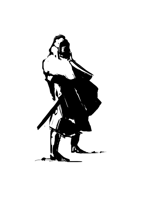
This was a study I did based this concept. You can see how I'm taking the shaded sections and grouping them into black. I like the style I know it's extreme, but in a way it allows for more of the reader's imagination to own the experience of reading my novel.

This was a study I did based on  Burt Wesley's  early Dishonored concepts.

This drawing is actually based on my existing design for the character Keeno. You'll notice this guy has a tail and is wielding a Bo Staff.

Tuesday, August 7, 2012

Echoes; Eye Candy

Hello everyone! It's been a few days since my last update. Some of you have probably already seen the artwork I created for the cover of the book. FYI, that's not the finished design; it was something I threw together in a couple days to give the unpublished copies, I have floating around, some semblance of production value. I do plan on polishing up the cover art a bit more if/when the book gets picked up by a publisher.

But I digress. Below you will find some  interior illustrations for the openings of a few chapters. You will notice the style is very line dependent and invokes that of a comic book. This is something I planned on doing from the beginning.

Anyway, Enjoy!

 Prologue

 "Midnight Train."

"A Stormy Ride."