There has been a specific plan laid out since I decided to renew my personal brand, PSYPHER101. The entirety of which revolves around marketing myself to new local clients. I knew it all started with the web site. I did not, however, know what my new site would look like. Not until recently, that is.
So the site is done. You're actually looking at it now. No... Not blogger or blogspot. But scroll up and you'll see the navigation. Go ahead, click something. I've integrated the navigation to my blog and as such have effectively added a dynamic blog management system, if not the most dynamic blog system, to my site.
Now comes the printed collateral. The brochure will obviously reflect the site in terms of content, but I digress. The name of this post is "Business Card." So let us talk business card.
Showing posts with label My Art. Show all posts
Showing posts with label My Art. Show all posts
Wednesday, September 18, 2013
Monday, August 12, 2013
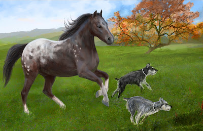
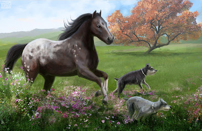
Selma's Appaloosa (final)
A couple years ago my wife and I took a trip to Utah, to visit family. During this time I was introduced to her grandmother on her father's side. The elderly woman is named Selma. Selma suffers from Alzheimer's and spends her days in a hospital. Worst of all is that almost none of her family ever visits her. She's in the hospital, alone, day in and day out.
When Jamie was talking to her she described how I am an artist and I promised Selma I would paint her something. Then we got home and I started doing research; asking Jamie what types of things Selma liked. I learned that Selma had a pair of Miniature Schnauzer's, a gray one and a black one. I also learned that she had a special place in her heart for Spotted Appaloosa horses.
This painting is the result of that. Below I will describe the process.
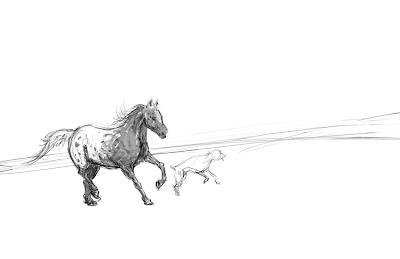 |
| This is the rough sketch. Here all I tried to do is figure out the perspective and angle of the horizon line. I opted for a canted angle to heighten the dynamic. |
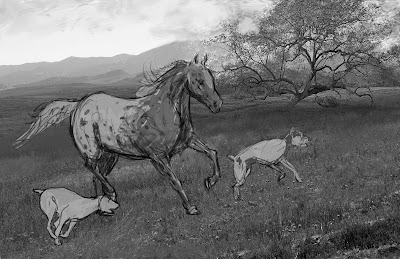 |
| I brought in 3 photos, one for the distant background, another for the tree in the midground, and a third for the grass in the foreground. Here I also introduced the second dog sketch. |
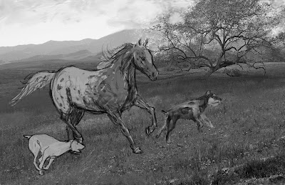 |
| I blocked in some basic value for the black Miniature Schnauzer, using photo references to understand the pattern and coloring of the coat. |
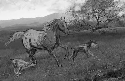 |
| Here I blocked in the value for the gray dog. |
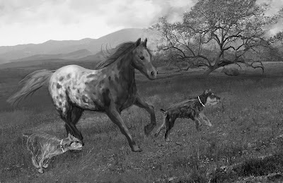 |
| Using the smudge tool in Corel Painter, I softened the pattern on the Appaloosa and painted in more contrast of value on the horse. |
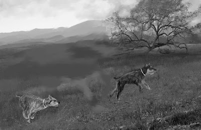 |
| What happened to the horse? I wasn't happy with the composition so I extracted the horse into a new layer and painted it out of the background. |
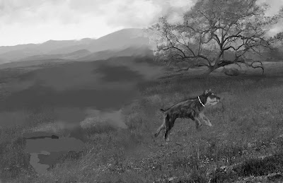 |
| I did the same for the gray Mini Schnauzer. |
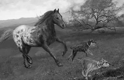 |
| Here I bring the missing elements back and establishing a more triangular composition. |
Tuesday, July 30, 2013
Viper 3
Here's a little story about a character from my book who, until a few days ago, was only a faceless figure vaguely described in the words of my manuscript. Before I continue let's have a look at him.
Viper 3 is his designation. He has no name and when you read the book you will understand why. Viper 3 is a soldier in the Elysian army. More specifically, he is a member of the elite division of the Elysian military called Viper squad.
Viper squad is the fictional equivalent of the British SAS, though much fewer in number. They train in all the combat skills that every other Elysian soldier does, but hold themselves to a much higher standard. That training is supplemented with advanced political and espionage training. These guys are not only dangerous on the battlefield, but also from the shadows and the crowds of any city in Giaos, even during times of peace.
They answer only to Emperor Tiberius Elystar.
The weapon that you see Viper 3 carrying is a type 1, variant 2, mass driver. This firearm delivers arcanium infused slugs at blinding speed. Before the invention of these devices the most advanced weapon was the bow and arrow. The variant 2 mass driver basically fires explosive shells, granted the explosive element is derived from the mystical element arcanium.
Now, for the development process of this illustration.
Credit: The final piece has specific aesthetic elements from a steampunk rifle I found on DeviantArt. It's hands down one of the coolest guns I've ever seen. Check it out here: http://johnsonarms.deviantart.com/art/Steampunk-Rifle-Outdoors-Photo-2-284228206
 |
| This illustration makes use of advanced overlay layers for texture. |
Viper 3 is his designation. He has no name and when you read the book you will understand why. Viper 3 is a soldier in the Elysian army. More specifically, he is a member of the elite division of the Elysian military called Viper squad.
Viper squad is the fictional equivalent of the British SAS, though much fewer in number. They train in all the combat skills that every other Elysian soldier does, but hold themselves to a much higher standard. That training is supplemented with advanced political and espionage training. These guys are not only dangerous on the battlefield, but also from the shadows and the crowds of any city in Giaos, even during times of peace.
They answer only to Emperor Tiberius Elystar.
The weapon that you see Viper 3 carrying is a type 1, variant 2, mass driver. This firearm delivers arcanium infused slugs at blinding speed. Before the invention of these devices the most advanced weapon was the bow and arrow. The variant 2 mass driver basically fires explosive shells, granted the explosive element is derived from the mystical element arcanium.
Now, for the development process of this illustration.
 |
| The drawing started as an doodle in Alchemy. At this point there was no goal with the design, just sketching random shapes. |
Credit: The final piece has specific aesthetic elements from a steampunk rifle I found on DeviantArt. It's hands down one of the coolest guns I've ever seen. Check it out here: http://johnsonarms.deviantart.com/art/Steampunk-Rifle-Outdoors-Photo-2-284228206
Wednesday, May 1, 2013
Refined Art Style for Echoes
It's been quite a while since I had a chance to work on my book. Lot's of life to deal with.
I'm starting to once again schedule time to rekindle momentum on the project. And so with that I present the refined art style.
I've been reading a lot of Batman New 52 graphic novels and have been reminded of my love for the genre. When I was in High School I sometimes thought about becoming a comic book artist. I never looked into it, but being an author never occurred to me, and look at me now.
I'm starting to once again schedule time to rekindle momentum on the project. And so with that I present the refined art style.
 |
| See? |
Tuesday, January 1, 2013
Hello Alchemy
I don't recall exactly how I stumbled onto this video (http://youtu.be/y4OwR1Pj_DU), but watching it inspired me to finally look into the open drawing project called Alchemy.
For the uninitiated. I encourage to try it once and see if you like it. I know after the first time just tinkering with it I was hooked.
For more info on Alchemy and instructions to download and install it, visit: http://al.chemy.org/
For the uninitiated. I encourage to try it once and see if you like it. I know after the first time just tinkering with it I was hooked.
For more info on Alchemy and instructions to download and install it, visit: http://al.chemy.org/
 |
| I created this tonight after 5 minutes with Alchemy. I had trouble with the face, but that's because I'm not used to the fill shape tool. Give me a few weeks and I'll have a better handle on it. |
Sunday, December 30, 2012
N0R4
In the spirit of fantasy classics like the original Clash of the Titans I am going to introduce a new character to my novel during the rewrite. N0-R4 (Nory for short).
Before viewing the spreads below I urge you to visit the page of Aristotle's Voice. Like his page and please like his songs, especially A Journey Home. The track was inspired by these paintings and together they will immerse you into the world of Giaos.
Before viewing the spreads below I urge you to visit the page of Aristotle's Voice. Like his page and please like his songs, especially A Journey Home. The track was inspired by these paintings and together they will immerse you into the world of Giaos.
 |
| Spread #1; pages 1 and 2. Nory patrols the vast wilds around Estro's research station. |
 |
| Spread #2; ages 3 and 4. Nory is almost home. |
 |
| Spread #3; pages 5 and 6. Nory approaches the research station. |
 |
| Spread #4; pages 7 and 8. Nory lands and we get the first clear look at him. |
Tuesday, December 18, 2012
Onyx Ape version 2.0
In my previous blog I said that I wanted Obsydia's forces to be made of mostly stone and what not, but after strong consideration it wouldn't make a lot of sense for the enemy of the world (as Obsidia is in my novel) to have forces that would be so easily dispatched. So I have re-designed the beasts.
This design is more reminiscent of a robot, and though my novel is technically fantasy, it does have certain Aesthetic allowances more common with Science Fiction.
I will give credit to my friend Mikella Touchstone for reminding me about the Warmachine tabletop game by Privateer Press. In this game the there are various factions that make use of machines called Warjacks. Warjacks run on furnaces with exhaust pipes and that's something my automaton's have in common.
 |
| The Onyx Ape version 2.0, standing near the edge of the divide; a tumultuous region of Giaos riddled with unpredictable geothermic activity. |
The Onyx Ape
This is another character/creature concept sketch for my novel. This monster looks menacing and for all intents and purposes it is, but one thing this picture is lacking is a scale reference. So I'm going to be clear about this now. The Onyx Ape is not very big. NOT BIG. In the pose seen below the top of the smoke stacks are no taller than five feet.
The idea behind this automaton is that they are similar in gesture to a chimpanzee or young gorilla. The arms are not very thick, but they are not meant to be overly powerful. They are, however, extremely fast and that's where the true danger lies.
Obsidia, the villain of the book, has an army of these machines. They are crafted using raw materials from her base underground so they lack the durability of steel and the stone sections of their bodies can be destroyed relatively easy.
That is not to say that they don't have metal in their bodies, because they do, but the metal is mostly used for the skeleton and certain areas that require reinforcement.
 |
| This is the first sketch of the Onyx Ape that I actually like. I will be designing exploration sketches with different "builds" I'm not sure what the final look of the monster will be. |
Monday, December 3, 2012
Daedalus Floor Plans
So I've spent quite a few days plotting out rough floor plans for the Daedalus Airship. I'm no architect, but I've done a lot of research and maritime vessels don't have overly complicated floor plans. Come to think of it. Floor plans in general are pretty simple. Just lines for walls and some simple door graphics, and stairs.
I didn't go into detail about the furnishings, but that's something I can work out in SketchUp.
I didn't go into detail about the furnishings, but that's something I can work out in SketchUp.
 |
| Here's the side view of the the ship. I drew this over the top of the sketch from last week. |
 |
| The Upper Deck is where the bridge(pilot room) and Estro's Room are located. |
 |
| The Second Deck holds the Water Filtration system, Anaya's room and some special guest rooms. |
 |
| Deck Three has a upper half of the Engine Room and half of the states rooms. |
 |
| Deck Four has the lower half of the Engine room and the rest of the states rooms. |
 |
| Deck Five has the Armor, the upper science/research labs, two mess halls, the lounge, galley(kitchen), and pantry. |
 |
| Deck Six has the briefing room, the lower science/research labs, the hospital, and six recovery rooms for injured or sick. |
 |
| Deck Seven is the lowest deck and has Stern deployment(used for Men at Arms), four holds, and a large loading bay. |
Monday, November 26, 2012
First Imperial Dreadnought Class Warship
 |
| A medium sized vessel with frightening firepower. |
I won't spoil any of the story by elaborating how this terrifying ship ceased to exist, nor why another like it was never again built, but lets just say it went out with a bang.
You'll notice that this vessel lacks the balloon's that are a major part of the Daedalus' profile. Tiberius never cared about the environment or the damage his fleet could cause to it. The simple truth was that having the ship completely outfitted with high yield turbines granted it better mobility. Anyone who knows about war will agree that this is a key fundamental to a successful offense.
I'm surprised I was able to knock this one out in only a couple of hours. Probably because I've come to terms with the direction of the Airships in my story.
There will be more to come.
I am proud to unveil "The Daedalus."
Here she is. The Daedalus.
As some of you, those who read my blog, may know. I decided to go in a different direction with the design for the airships in my novel. The new aesthetic invokes the majesty of European Galleon's of the 18th century and also showcases the influence that games like Final Fantasy 6 had on me growing up.
The book still opens with the First Imperial Fleet of Aerial Warships being advanced vessels, complete with Arcanium turbines, heavy armor, and powerful weapons (imagine a flying battleship with the look of a 19th century ironclad).
But this ship, The Daedalus, belongs to Estro Salius, the world renowned engineer. Estro is responsible for most if not all the technology found in Giaos, but he witnessed the cataclysmic destruction of the First Fleet and as such has made an active effort to balance the use of Arcanium technology with an ample dose of humility. For this reason The Daedalus makes use of wind currents and often only uses Arcanium turbines to create lift. The stern of the ship is, however, outfitted with a pair of high yield turbines in case of an emergency.
So I am completely happy with the look of this sketch. The next step is to draw a front view so I can then start the most challenging step, modelling the ship with 3D software. This process is something I haven't done in ages and I'm unsure if I even have a program that I can use to do it. I know some people use Google Sketchup for this type of project. So that's probably going to be my best bet.
Until next time! Time for bed...
Saturday, November 24, 2012
The technology of Echoes re-imagined!
I just had an epiphany. I am going to completely overhaul the concept of the technology in my book.
As it stands everything is leaning more towards Sci-Fi. And although I am a fan of the genre, I want to strike a better balance with my love of Fantasy. So... I have decided to redesign the Daedalus Air Ship.
Instead of being completely driven by turbines and Arcanium Cyrstals. It will make use of a series of high yield Arcanium Turbines that are only meant to keep the massive vessel aloft. And to inject logic into the overall design. I will set a rule that forward locomotion will be gained through the employ of traditional sails and wind.
This new direction gives me an opportunity to hinge an early plot device around the design. Estro, being mindful of his past mistakes and the catastrophic explosion that decimated the First Imperial Fleet of Aerial Warships, is an advocate for cautious use of technology. I would elaborate further, but that would risk giving away too much of the story.
In closing; This new direction will have some major repercussions to the context I've established with the first draft. It's very exciting stuff.
Thursday, November 8, 2012
Weird creature
Tonight I loaded up another Feng Zhu DVD. I love this guy's wide range of techniques. He drew this piece with pencil on white paper. I worked digitally with Sketchbook Pro being the primary software.
Unlike his approach I can't change the width of the pencil on the fly and drop in broad strokes of value so my drawing has a lot more crosshatching. At the end of the demo I kept on working on the piece by dropping in a warm grey multiply layer and then going over it all with a white color pencil. I also through in a 10% opaque dark green multiply layer to add more depth and color.
On the down side. I've been all over the place with regards to my style of choice for the art in my novel. I think what I'm trying to do is sample a variety in hopes of finding a good blend. Only time will tell.
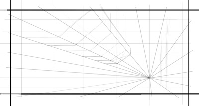
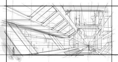
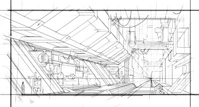
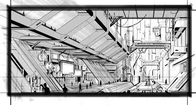
Detailed environmental drawing.
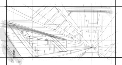
A couple days ago I started this drawing. I followed along with Feng Zhu (one of my favorite artists) from beginning to completion. This is his concept. Feng worked with ink and marker and according to the DVD, which didn't appear to be sped up, he finished in approximately 2 hours. I tried to replicate his technique using digital. I worked mostly with Autodesk Sketchbook Pro, as it has a great ruler and ellipse tool. It took me a total of approximately 6 hours to do this as I would constantly pause the DVD and do my own thing.
This was a very fun exercise. I look forward to doing more as I continue to work through the rest of my Gnomon DVD collection. Eventually I will go back through and attempt to apply the things I learn to my own universe and characters, primarily those from my novel.
Below you can see the step by step process I used.
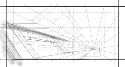 |
| Here I started freehand drawing some more forms and dropped in some value to help define the main building in the foreground. |
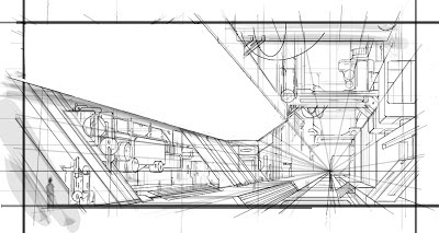 |
| I was unhappy with the upper structure. I had eyeballed the perspective but it didn't read as I wanted. So I erased it with a plan to remake it. |
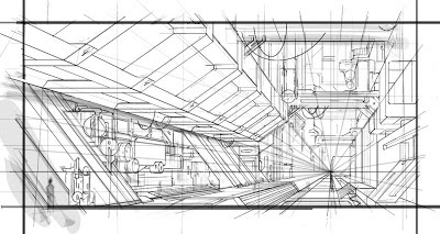 |
| Here I "rebuilt" the upper structure using some tricks with perspective drawing to ensure that the shapes repeated into the distance with accuracy. |
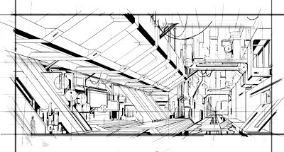 |
| Back in Sketchbook Pro I used the felt pen tool to start blocking out shadow shapes and help some of the suggested forms pop more. |
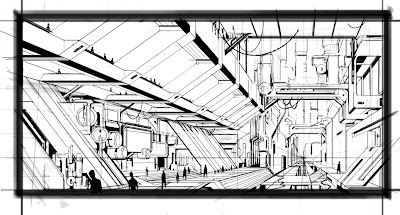 |
| The pen stage is just about finished here. I added some figures for scale. Now you can really tell how big this structure is and threw down a dark frame to give the viewer a focused point of view. |
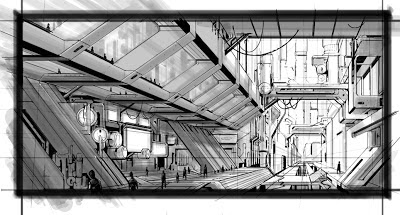 |
| Almost done. I added some more value to really bring the closer objects forward. Finally I added some white highlights to the edges of hard surfaces. |
Subscribe to:
Posts (Atom)


