I found a high quality tutorial for creating an HTML5 contact form.
http://net.tutsplus.com/tutorials/html-css-techniques/build-a-neat-html5-powered-contact-form/
The tutorial makes use of HTML5 boilerplate, which is apparently a very flexible bare-bones template for web designers. I will definitely look into using this if there's any chance it could save time and lower development costs for me and for my clients. But, as with anything else that deals with web technologies, learning how to use it effectively will take time.
Regarding the contact form. I will follow along with the tutorial and make a functioning stand alone contact form page that isn't connected to the PSYPHER101 blue site (the name I've given the the project), but it will be connected to my info@psypher101.com email address. Once I get it to work I will attempt to peel away the layers of code and adopt form functionality to the blue site quick form, located in the footer.
In the mean time I will simply get the rest of the buttons throughout the site to animate like the ones on the homepage.
You can view the latest build of the blue site here: http://www.psypher101.com/web%20templates/portfolio2/
Friday, August 30, 2013
Rollover Dichotomy
The latest changes to the site/template have been extremely
subtle and easy to miss. Yesterday I shared a CSS trick for creating rollover
images. Then I did some research and found a way to animate specific attributes
of a CSS class using JQuery and the color 2 plugin. I did that, spent a couple
hours learning, and then, almost by accident, learned that CSS3 supports some
animation functions of its own. These animation functions are called easing. I’ve copied and pasted the code from the
style.css file.
.blue_button {
color: white;
padding: 7px 12px;
text-align: center;
border-radius: 5px;
border: 1px solid #1e30da;
background-color: #1e30da;
box-shadow: inset 0px 1px 1px rgba(255,255,255,0.5), 3px 3px 3px rgba(0,0,0,0.3);
-webkit-transition: all 0.8s ease-in-out;
-moz-transition: all 0.8s ease-in-out;
-ms-transition: all 0.8s ease-in-out;
-o-transition: all 0.8s ease-in-out;
transition: all 0.8s ease-in-out;
}
.blue_button:hover{
color: white;
text-decoration: none;
background-color: #333;
border: 1px solid #fff;
}
This allowed me to remove the image buttons altogether and go
with an optimal solution. Firstly, the new animation is fluid and looks
amazing. It's not a toggle swap like the rollover. A CSS3 transition controls
to animate the inner glow on social media buttons in the footer. Now it’s time
to create a nice focus animation for the contact and newsletter form.
The WOW Slider Conundrum
Next on the agenda was the "Latest Works" column on
the home page. The goal was to get it to animate in a similar fashion as the
graphic slider, but not identically. This area of the website will feature the
4 most recent projects. The challenge was
to see if I could animate it using the existing code that I used on the graphic
slider. I knew I would have to customize it, but wasn’t sure if I would have to
make changes to the Javascript file. As it turned out I definitely would have
and that is something I am not quite prepared to do.
I had my goal all but complete when I decided it wasn't good
enough. The problem had everything to do with how the WOW Slider affects the
HTML content differently from images. Images will fade into one another whereas
text elements fade away before the new text fades it. This was inconsistent and
jarring, to be frank. So I scrapped it and decided to start over. One thing I
can be proud of is that I did not feel compelled to keep any of the HTML or CSS
code intact. I did not even comment the code to disable it. I simply deleted
it. Knowing full well that I would be able to start fresh and not be
intimidated.
After a long break I downloaded the JQuery Cycle2 plugin to
handle the animation effect I wanted for the latest works column. I was
absolutely blown away by Cycle2. I had only been working with it for about 10
minutes before having the content animating exactly the way I wanted!
Open Source or Bust!
With Superfish installed it was time to get the navigation animated.
There is a chaotic elegance when it comes to open source plugins. On the one
hand, they are absolutely free and that counts for a lot. The downside,
however, is that a lot of these plugins do not come with proper documentation
to help someone less experienced make sense of what they are doing and that is
where the beauty of the internet takes center stage.
When using an open source plugin it’s a good habit to do a
group of searches and try to find websites, blogs, or forums that discuss the
plugin. More often than not someone else, somewhere in the world, has run into
the exact same problem you are having and yet another person has come along to
aid them.
Regarding Superfish; Joel Birch is a genius. He wrote the
plugin and is surprisingly helpful. I scoured the web for working examples of
Superfish menus, inspecting elements and analyzing the code to try and make
sense of what I was looking at. During this process I found numerous forums and
blog post where Joel Birch himself chimed in to help shed some light on the
plugin.
With the navigation menu finished I found the time to start on the graphic slider at the top of the home page. For this I used a plugin called WOW Slider. Unlike Superfish or other JQuery plugins, WOW Slider is a stand-alone application with a cost for using. The developer offers a free version, but this version has the logo and a link plastered all over the output. What I did instead, was use WOW Slider to create the look and feel I wanted. Then I dove into its source code to study the implementation. It took a few hours to get right. Eventually I got it done.
With the navigation menu finished I found the time to start on the graphic slider at the top of the home page. For this I used a plugin called WOW Slider. Unlike Superfish or other JQuery plugins, WOW Slider is a stand-alone application with a cost for using. The developer offers a free version, but this version has the logo and a link plastered all over the output. What I did instead, was use WOW Slider to create the look and feel I wanted. Then I dove into its source code to study the implementation. It took a few hours to get right. Eventually I got it done.
I decided I'm going to introduce a recurring theme to the graphic
sliders of my website. It has been a couple weeks since I painted anything. I
can justify doing a painting for the sake of my website. I am going to do a
matte painting of an airborne vehicle superimposed over the majestic vistas
that are now in the graphic slider. I am considering the Daedalus airship from my
novel.
A Footer to Gather a Thousand Words
I decided to
switch up the footer section from the original Photoshop layout. I removed the
contact form from the contact page and created a new miniature form to exist in
the footer. By being there it will persistent on every page. This will in turn
allow people to contact me whenever they want. There is no way to predict when
someone might feel compelled to do so and I would rather offer them a faster
means to do so
The contact
page will have physical contact information, but visitors will no need to go to
that page to get in touch. I also added some social networking links. Another
thing I have neglected, historically, is the use of social media. I use
Facebook about as much as any other responsible adult. And given the
flexibility and power of social media in today's commercial climate, I've
reactivated my Twitter account and am making an active effort to "tweet"
often. Oddly enough tweeting is not much different from posting a status update
on Facebook. I do understand the impact of such social portals and any
working professional would be wise to make the most of their network.
Re-designing
the footer set me back a couple hours, but I think it is better this way.
Sometimes a person has to take a couple steps back to take a few steps forward.
It took me a few days to finish the layout, including the
home page. I contemplated adding content, but opted instead to focus on
enhanced functionality. Using Javascript (JQuery to be precise) I plan to animate
the graphic slider, all the form elements, the main navigation submenus, the
"Latest Works" column of the home page, the buttons throughout the
site, and clickable images. Tha will probably take me a couple days of work to
finish.
I downloaded the JQuery Superfish plugin, to use for the
dynamic animated main navigation. It is always difficult to customize someone
else's code without notes. This is why programming, regardless of the
complexity is mostly trial an error.
Browser Awareness
The template I had been working on is now green lit to be
used as my new website. I figured that if I’m going to invest this amount of
time to develop a working website, I may as well give it a foothold and
opportunity to be seen and appreciated by others; especially potential clients.
Hours into the design I was forced to fix a significant number
of issues with the layout. These issues were discovered when I moved away from
designing the site using the laptop. I turned on my desktop computer (that I
normally use for painting) and saw that almost everything was hugging the left
side of the browser window. I missed a crucial step in the prototyping stage
and am now had to solve it. This is why, all web designers, check their
previews in multiple browsers and at least more than one computer. I am glad I
ran into this sooner rather than later.
At this point, the project weighed in at about 30+ hours so far. I have run into a series of issues that have forced me to think critically to find solutions. This project will be a prime candidate to write a Case Study about. These posts will effectively produce the research material I will use for the Case Study.
Regarding the contact page; I embedded a functioning Google map. Although I do not intend to have clients come to me physically, I figured it is good practice as some businesses I may contract for might need this feature.
A Paradigm through Conversion
Progress on
the template is along smoothly. I finally understand the 960 grid system beyond
of its basic concept. It is actually really simple once you get used to it.
Also, something of a milestone; is the fact that I don't have to work in Adobe Dreamweaver
using Design or Split view modes anymore. I am almost
exclusively building the template directly in Code view mode.
I know this probably seems trivial, but I think of it as a
sign of growth; a paradigm in my way of thinking and my overall opinion of Web Design
as a creative medium. Maybe there actually is potential to express myself as an
artist in a programmatically dominated environment.
Regarding the template; I have added a functional navigation and respective pages. They are, however, mostly lacking in content. As of this writing the 960 grid is used on every page. I made some major changes to the navigation. It is now cleaner and uses CSS formatting instead of images. This is preferable as it reduces the load time of the entire website; the less images used for the interface and layout, the better.
Regarding the template; I have added a functional navigation and respective pages. They are, however, mostly lacking in content. As of this writing the 960 grid is used on every page. I made some major changes to the navigation. It is now cleaner and uses CSS formatting instead of images. This is preferable as it reduces the load time of the entire website; the less images used for the interface and layout, the better.
The tutorial
I'm using for reference describes how to make a
WordPress template from the design, upon further inspection; this is not
actually covered in the tutorial, it is only suggested as a possibility. However,
turning static HTML/CSS websites into functioning WordPress themes could be
very lucrative.
The 960 Grid
I have
encountered the 960 grid system before, when modifying pre-designed web templates
for clients in the past. Mostly I have only been exposed to it via a CSS file
called grid.css or 960.css. In the past I did not know what to make of it.
Looking at those CSS files I noticed a series of classes called grid, prefix,
suffix, push and pull; and all of them had derivatives (grid_1, grid_2, etc.).
As it turns out, the 960 grid system is not an actual component or element of
CSS, but a stylesheet created for ease of work.
What the
stylsheet essentially does is offer a designer a pre-built group of classes
that effectively divides a 960 pixel wide block into either 12 or 16 columns. So
I am relieved to now learn it has a presence within the Photoshop Web Design
community. I found a Web Design tutorial that uses this grid and dove in. Going
forward I will be applying this gird to all my designs.
The template
I created, using the 960 grid, is a beast! It is a Layered Photoshop file, weighing
in at 56MB and it has given me some great ideas on how I can modify my other templates
I’ve made. It took me pretty much an entire day and that was only the
layout/template. The content is mostly filler with the exception of the graphic
slider image I made.
High resolution version of the template viewable here:http://psypher101.deviantart.com/art/Portfolio-2-Photoshop-layout-393771255?ga_submit_new=10%253A1376694657
A Major Change
That's it...
I'm switched majors. After a confusing re-admissions effort I am officially
returning to school on September 30th. I am no longer chasing the Game Art & Design
dream, it's too risky and with all the layoffs in the industry I'll be
competing for the same jobs with people that have a lot more experience than I
will. So I’ve decided to go Graphic Design & Web Design.
I already freelance
as a Graphic Designer and have historically refused Web Design jobs, due to the
fact that I did not enjoy the work. The fact of the matter is I did not enjoy
it, because I am not an expert. Just like anything in life, if a person does
not excel at a specific type of work it has a tendency to become frustrating,
but also; with a proper amount of tenacity and dedication said person will
eventually become skilled at that task.
If I get the
proper training strengthen my skills in this field then I will be able to earn a
significant amount of money. And the best part is that as a Web/Graphic
Designer I can work from anywhere in the world. Don't worry, though, I will
continue improving my painting skills. And one day I will be published. My
manuscript isn't going anywhere. For now, however, Web Design projects and
experiments need to take center stage.
Monday, August 26, 2013
PSYPHER101 website facelift
Any of you that follow me on Facebook will know that I'm going through the process of completely redesigning my official website. The entire project is more about the journey than the destination. Granted, I want the final result to be absolutely functional and hit on every mark, it's the process that is the focus here.
I am an artist who is familiar with Web Design, but have never actually touted myself as an actual Web Designer. Now, however, as I am preparing to return to school with Web Design & Graphic Design as my focus; the technologies and commonly used practices are ebbing to the surface of my schedule.
I am an artist who is familiar with Web Design, but have never actually touted myself as an actual Web Designer. Now, however, as I am preparing to return to school with Web Design & Graphic Design as my focus; the technologies and commonly used practices are ebbing to the surface of my schedule.
Monday, August 12, 2013
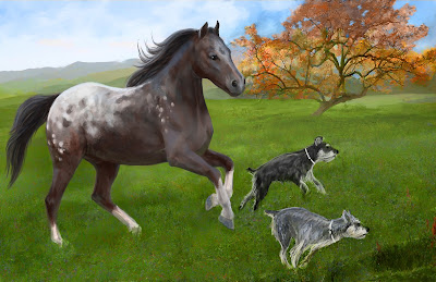
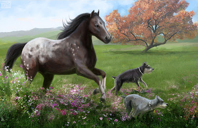
Selma's Appaloosa (final)
A couple years ago my wife and I took a trip to Utah, to visit family. During this time I was introduced to her grandmother on her father's side. The elderly woman is named Selma. Selma suffers from Alzheimer's and spends her days in a hospital. Worst of all is that almost none of her family ever visits her. She's in the hospital, alone, day in and day out.
When Jamie was talking to her she described how I am an artist and I promised Selma I would paint her something. Then we got home and I started doing research; asking Jamie what types of things Selma liked. I learned that Selma had a pair of Miniature Schnauzer's, a gray one and a black one. I also learned that she had a special place in her heart for Spotted Appaloosa horses.
This painting is the result of that. Below I will describe the process.
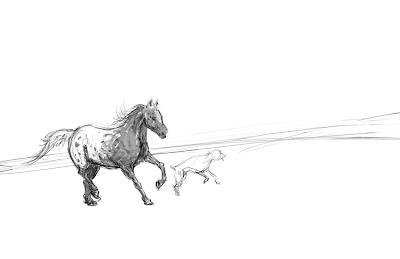 |
| This is the rough sketch. Here all I tried to do is figure out the perspective and angle of the horizon line. I opted for a canted angle to heighten the dynamic. |
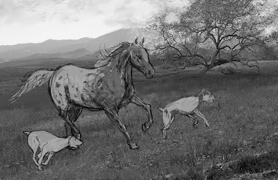 |
| I brought in 3 photos, one for the distant background, another for the tree in the midground, and a third for the grass in the foreground. Here I also introduced the second dog sketch. |
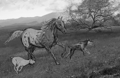 |
| I blocked in some basic value for the black Miniature Schnauzer, using photo references to understand the pattern and coloring of the coat. |
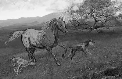 |
| Here I blocked in the value for the gray dog. |
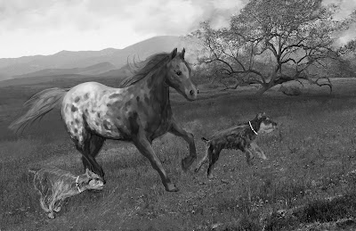 |
| Using the smudge tool in Corel Painter, I softened the pattern on the Appaloosa and painted in more contrast of value on the horse. |
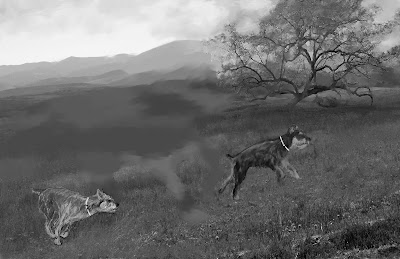 |
| What happened to the horse? I wasn't happy with the composition so I extracted the horse into a new layer and painted it out of the background. |
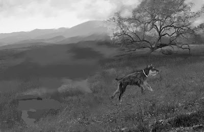 |
| I did the same for the gray Mini Schnauzer. |
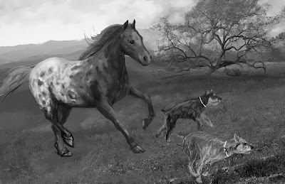 |
| Here I bring the missing elements back and establishing a more triangular composition. |
Subscribe to:
Posts (Atom)


